-
You have a wide range of colours used on the fonts which makes the font stand out. You photography skill are good as the eye contact from the guys on the cover engages with the audience. You have experimented with the layout of the font which is very creative and unique as some fonts are slightly slanted.ReplyDelete
-
The use of different tag lines are really appealing and tell a lot about the contents inside the magazine and they catch attention. what could be improved if you used less of the tagline and had cut out the image of the student to make it look more professionalReplyDelete
-
The front cover which you have created is very appealing and will attract college students, this will be because of the colours and models use. The models are posing in a way college student would. To add to this the text is well written and is written in a context which students can relate to, however to criticise i think that the text should have been organised differently.ReplyDelete
-
Good magazine cover Raf, you've used a various different colours which makes you magazine appealing and eye catching, the choice of colours relate to the theme of the magazine. However, I believe you could have placed your text in more appropriate place, for example the yellow text on the the yellow top isn't eligibleReplyDelete
-
-
Your magazine cover is effective at standing out as there is a range of different colours used.You have used many conventions of a magazine such as a barcode and cover lines however to give your magazine a more professional look it would have been better to have the sidelines all going horizontally. Great work Raf.ReplyDelete
- Your content page is amazing and very appealing, it also shows a picture of a typical college student. the font of the cover page is very colourful however it needs to be more organised as i believe columns should be used to make it more professional.ReplyDelete
you also haven't stated the links of the Facebook/ twitter as you showed a picture instead which is not really helpful for the audience. -
Your contents page can be related to college students because of your image; the text is good however the text should have been a different colour or font because it's hard to read. the Facebook and Twitter images could have been presented better.ReplyDelete
Tuesday, 21 October 2014
The comments on my magazine and content cover


Thursday, 16 October 2014
Pictures for college magazine


The first picture sees me and Fateen just sitting inside the college building, chilled out. The second shows me and Jordan, and the final picture sees me and Zahra as "study buddies".
This photography was taken through these people's phones, under my advice and later they sent it through my email. These images are at a decent level for me to create a magazine.
6. Drafting + finalizing house styles and layouts.
(Planning the music magazine)*House style – Consistent Style, elements.
(Genre) Masthead – Design ideas - Try a few - make notes of what you like about them
Font
Colours
Layout
Content
*Proposal – Outline of your idea.With as much detail as you can.(You can ask class in pitch for feedback)
What music genre?
Who is the target audience?
How can you use your case studies? -
Is your audience similar Who is / could be the publisher? Say why
Price?
How often will it come out?
Distribution?
Thursday, 9 October 2014
Evaluation for piracy
Evaluation
of my article
From
the feedback I have received from the article, I believe that the article is
supportive in which I have a strong argument on why piracy is not such a
terrible thing as people justify it is from the research I have been assigned
to do, although from what I think the article could be a little more
professional Throughout the article, my language is mainly formal to target the
audience at the age of 13-20. The target audience for The Sun, the article I did, would mainly be for children and
adults, because it is for them to understand the text and get the message. One
celebrity in my article is Naughty Boy because he is an artist. Although my
article seemed effective and the layout is organised, the colour is way too
colourful, the page seems like a newspaper, so the improvement that could be
done is to make the article just simple.
One
of my strengths in my research are for starters, is the research on when piracy
began, and lead to people download illegal music; this makes the reader
understand, the effects in my words. This will give the reader to give
opinions, whether piracy is good or bad. On the other hand, the research proves
to be unreliable as the text in my article is shown not to be detailed and it
gives out a biased, un-balanced information. This was my first time using in
design. At first, I found it hard, but it eventually got easier to get used to
how to operate InDesign. One of my strengths in Design, were that I knew some
of the tools, because it was similar to Photoshop I slightly knew how to use to
tools. However, the weakness in my article shows not to have page numbers and
the pictures show to be squished.
Following
the feedback I received, after designing a questionnaire, my article managed to
meet the criteria, despite the cons. The positive is received through the
feedback is that it was a formal text and the layout is organised, although the
improvement of my article could be the fact that there could be a limited
amount of text, not too long, and make the article quite simple. Furthermore, I
feel like my article could interact with the audience to connect with them.
My Context Cover

My context magazine is in black and white styled design. This is a medium close up photo of me and Jordan. The two of us are looking at the audience in a direct approach to grab the attention.
The magazine also contains subtle and effective texts, that would appeal to college students, because it has a more serious, but fun type of words, that it would want to make the audience see that the friendship between me and Jordan, will attract the audience attention.
My Media Questionnaire
Questionnaire
After I had created my own piracy article whether piracy is good or bad, I had to do a questionnaire, on which I had to write questions for the people in my class based on what they think of my article.
.jpg)
Wednesday, 8 October 2014
Case Studies and Media Kit


In this NME media kit, it provides us the information about the average reader of the age. The data in this media kit provides us the information that that NME is more suitable for men at the age of 17-30 years old. The price is also there as starters to see the price is £2.20.


Finished Media college magazine

AS Media college magazine.
My media magazine is at a well standard style. The magazine has a medium shot handsome display close-up of me and Fateen sitting on the inside college bench, and both of us are looking directly towards the audience to grab their attention. This would also be appealing to female gaze, and maybe men. Not only that, the background on the inside of the college uses presentational devices for affect as if the picture is quite realistic. The purpose of having the medium close up is that so the audience would be appealed, which would want to make them buy the magazine.
Furthermore, my college magazine has texts that are subtle, but they should gain the readers, such as I have made my magazine look quite educated, but quite fun at the same time.
Also, I have a barcode to which it shows importance to the magazine, and I have included an Math challenge, to which everybody wants a IPhone, so I used this tactic for educational purposes.
I'am overall quite pleased with the magazine in spite of some cons/errors alongside the fact that I have had a lot of fun having taken pictures at a decent location of the college.
Tuesday, 7 October 2014
Magazine college layout

Magazine Preperation
During Media with Amy, before I had to create my actual article for college, I had to prepare myself by creating a draft for my magazine cover; this had helped me get an idea on where I will put my images, texts, headline, and subtexts so I would understand in the process on how an magazine would look like in general.My first Photoshop work in media

In our media lesson, we have been learning how to use InDesign. The purpose of using this software is for us to get comfortable how to use it and to get confident knowing what we are doing. This software dramatically helped me for my course.
- How to add and lock layers
- How layers are used
- How to place in images
I was shown on InDesign how to blend the colours along with the image, without making it disappear. At first I did not know how to use the software and I was a little uncomfortable, but I was able to learn quickly, and this will help me build my confidence with this website.
College article analyzing
College article analyzing

I used Chris Brown as a magazine cover to analyze the magazine. The use of his image and the way he is dressed allowed the audience to become attracted to the magazine, because he is a well-known artist and is shown to be comfortable with his clothes. The background was also there because the dynamic background really suited the magazine cover.
_Page_1.jpg)
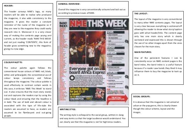
During the lesson with Zaf, we were analysing college magazines, in which we were preparing to create an college magazine for our coursework.
I chose this magazine because it grabbed my attention. The magazine itself contains many devices that were used for effect. The medium long shot of the girl is subtle. Her appearance, in which she looks quite innocent flirty, and her direct approach to the audience is what gained my attention, as if I felt I was connecting to her. The smaller features also seemed to look quite fun and interesting, and gives me something to read about.
Finally, while analysing the magazine cover, I had arrowed how the magazine uses technique to attract audience attention, alongside the fact I named everything that was inside the article (i.e. Barcode and Subtitles).
Subscribe to:
Comments (Atom)
furthermore, you have certain text which overlaps the image, this is seen as unusual and quite unique however there is still little room for improvement such as organizing cover lines and lining them up on the side.
overall, well done! and a excellent job with your front cover